Throughout the mid to late 1990s and 2000s, one of the trends in PC gaming was games really incorporating level design into the gameplay design, as well as level design having a very strong artistic presence (and not just for background visuals). The levels in many of those games really impress you and make you think a team of geniuses were behind it.
Comparatively, the trend today for level design is to minimize its influence on gameplay design, instead focusing on big empty sandboxes with very little detail or tiny snippets of levels with invisible walls everywhere designed to funnel the player into the next cutscene. Multiplayer shooters that are not about just a large sandbox (e.g. Battle Royale) instead often provide just a few levels of the same scale as many 2000s PC games, but without the detail or intelligent design.
In this article, we’re going to examine more closely how and why this came to be.
Single Player Action Games
From FPS to other kinds of action games, the two opposing trends mentioned above are readily apparent. Let’s start with single player games. I can just throw out some names like Half-Life (1998), Half-Life 2 (2004), Turok: Dinosaur Hunter (1997), Turok 2: Seeds of Evil (1998), Thief: The Dark Project (1998), Thief II: The Metal Age (2000), Deus Ex (2000), Painkiller (2004), Serious Sam: The Second Encounter (2002), Prey (2006), Rainbow Six (1998), Rainbow Six: Rogue Spear (1999), Rainbow Six 3: Raven Shield (2003), SWAT 3: Close Quarters Battle (1999), SWAT 4 (2005), and everyone who is familiar with any of these will immediately think of how important the level design is to the gameplay and overall experience with those games. And that level of importance and how memorable those levels are is endangered, but not extinct, in modern day gaming.
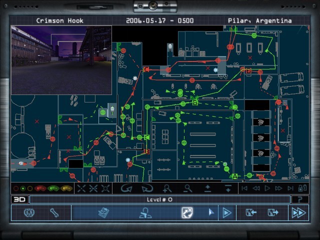
The pre-mission planning of Rainbow Six 3 is necessary not only due to the tactical difficulty of the game, but primarily due to the insanely complex yet realistic level design that actually gains complexity from being realistic in its approach.
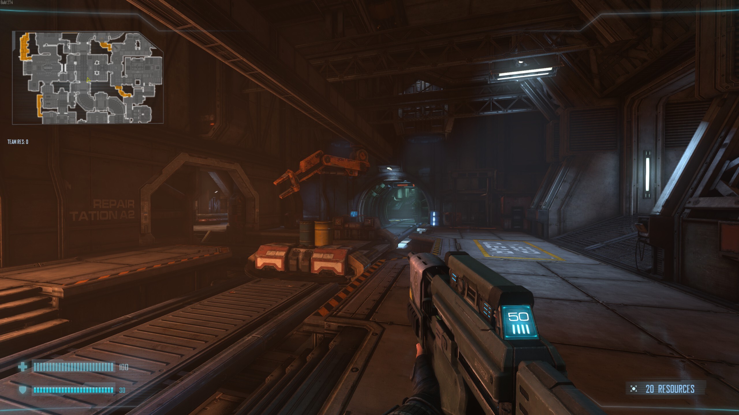
Compare those to your Call of Duty games or other mainstream FPS games from RAGE 2 to the modern day Far Cry games and MachineGames Wolfenstein games (all of them), compare those classic Rainbow Six games to a modern day copycat (being a copycat isn’t even a bad thing here) like Ground Branch, and you’ll see that in all the modern games level design is far more simplistic, far less detailed, much less thoughtfully integrated into the gameplay process.
Granted, Call of Duty never excelled in level design, going back to the very first game. The RAGE and modern day Far Cry games encompass the “big generic sandbox for the player to just fool around in” design, the first two MachineGames Wolfenstein games (The New Order and The Old Blood especially) are often particularly offensive for their consolized tiny sliver of levels filled with invisible walls preventing the environment from ever playing a significant role in gameplay. Ground Branch levels were clearly just thrown together very quickly and only represent what seem like training maps.
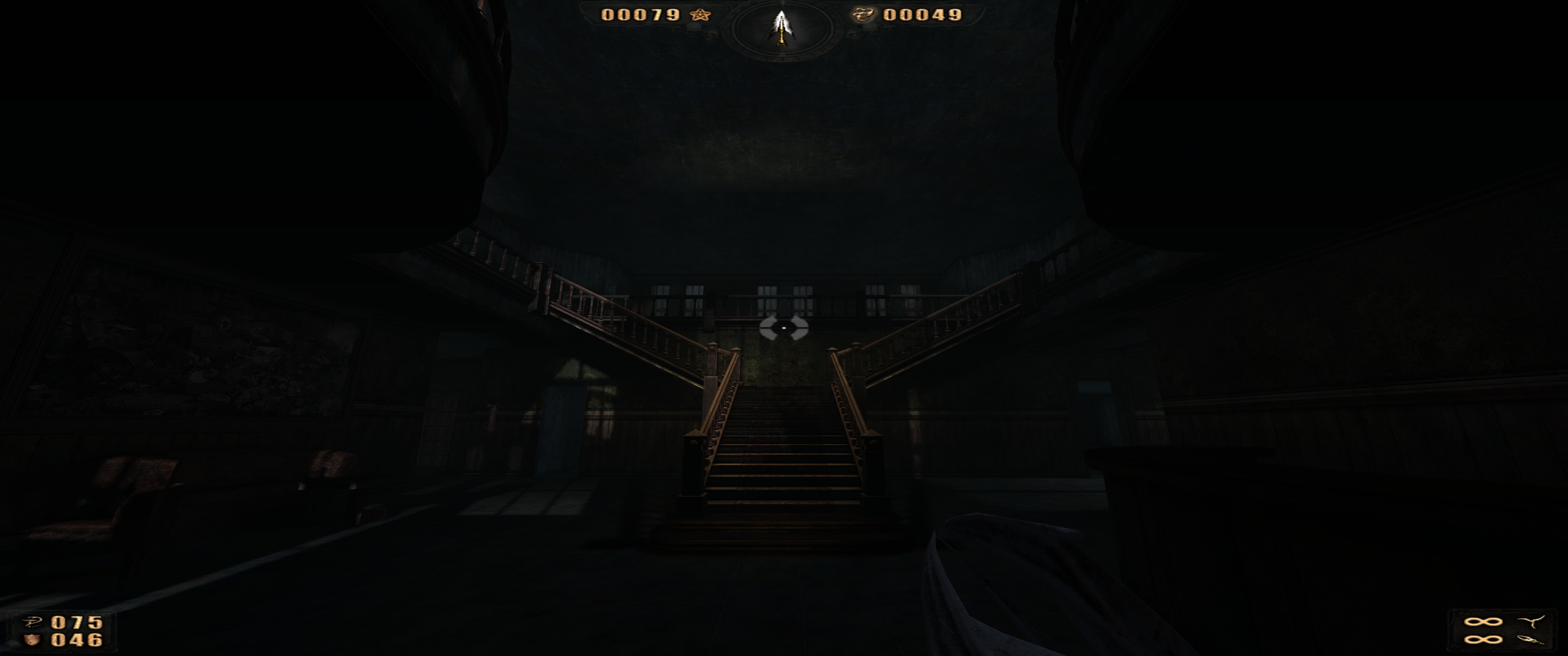
Painkiller is a lightning fast paced demon killing FPS game introduced in 2004. One of its specialties is atmosphere, oddly enough. It takes every classic horror setting you can think of and far more, and brilliantly makes them into its own, thoughtfully putting a spin on the horror tropes associated with these locations. From haunted asylums to cemeteries and crypts, prisons, cathedrals, and far more (24 levels in the first game alone, all immaculately detailed), you will face the types of enemies you’d expect to find in these classic horror scenarios except each has a unique twist to them, along with highly interactive levels and objects and destruction and cleverly implemented secret areas and items.
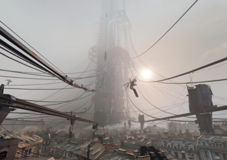
In the Half-Life games, every level brings something unique to the table and changes the gameplay drastically from lower resource survival gameplay to shooting and bashing aliens, to working your way through practical environmental obstacles, to engaging in shootouts with both marines and aliens who also attack each other, to vehicle sections in the sequel, and the list goes on.
Look at the absolutely genius maze-like level design with brilliant secrets in Turok’s Treetop Village or Turok 2’s Lair of the Blind Ones and Hive of the Mantids, these things just hardly exist anymore or don’t at all (there is nothing like those Turok games anymore).
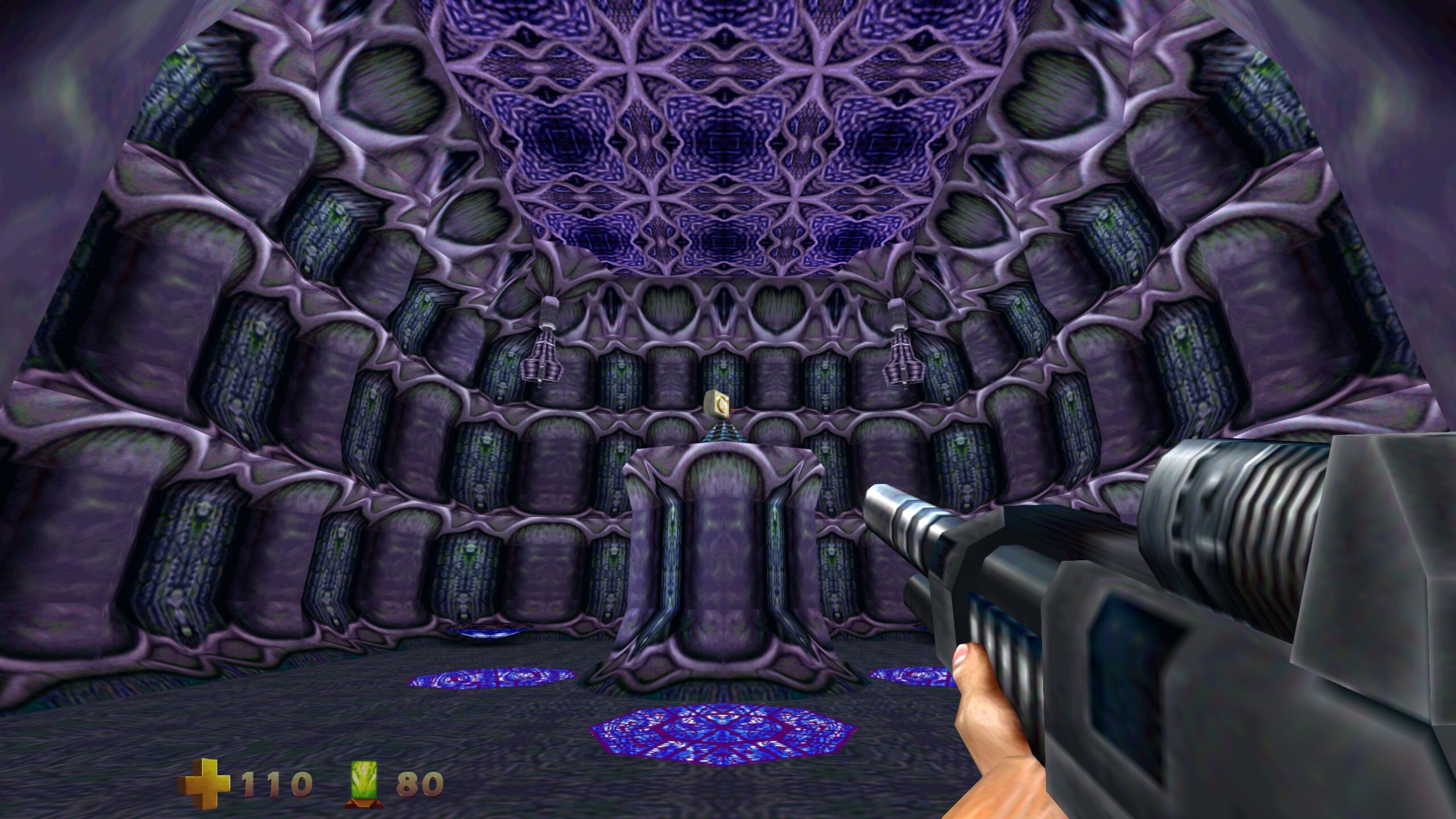
Turok: Dinosaur Hunter and Turok 2: Seeds of Evil (pictured above) were my favorite and most played games growing up. I played them many times as a child when they were new, too many times to count even, yet even when replaying it now I miss important things and have to go back for them due to the incredibly well executed maze-like complexity of the level design.
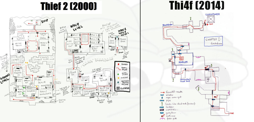
Look at the breathtaking attention to detail and truly genius secrets design in the first two Thief games and compare them to the 2014 joke of a game (note: the header image is not cherry picked, that’s just the second level of each game). Look at the insanely creative and unique levels of Serious Sam: The Second Encounter and its genius secrets and compare them to Serious Sam 3: BFE (2011) which is a good game but levels are just kind of there, not doing nearly as much to engage the player and change up gameplay.
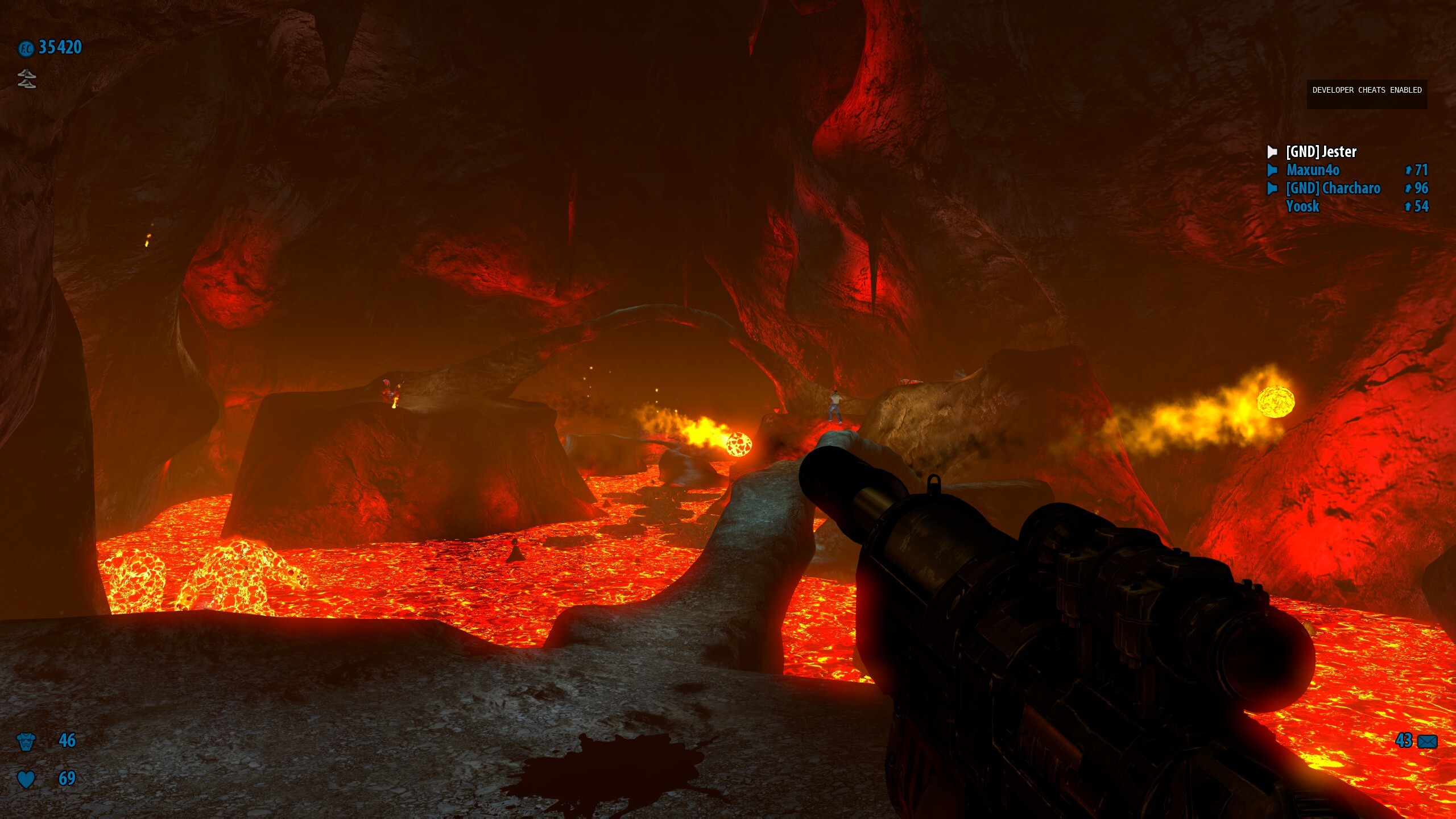
From platforming sections, all of which are unique throughout the game, to frozen icy slippery terrain, to ancient Egyptian pyramids filled with unique traps that sometimes split your team up across totally different locations, to huge outdoor areas with enemies sniping you from kilometers away, to interactive death traps, you never know what level challenge you will come across next in Serious Sam: The Second Encounter.
We might never see a CQB tactical shooter as brilliant as the first three Rainbow Six games ever again. In my opinion, when it comes to first person games, the importance and genius of level design in the first two Thief games and first three Rainbow Six games is unparalleled.
All of you know Rainbow Six as a tactical FPS, but so is Ground Branch which clearly wants to be like a modern counterpart. Yet the first three Rainbow Six games would amount to very little if not for the sprawling complex, realistic, and highly interactive level design that has no equal. Whether you’re in a mansion or some kind of urban complex from the meat packing facility to a vehicle tunnel or a private airport, Rainbow Six makes sure to not leave out rooms and corridors and maintenance tunnels you’d really find in these complex places, separating it from most games and significantly increasing tension and tactical difficulty.
This is of course nothing like the competitive Rainbow Six: Siege with much smaller, simpler maps based entirely around attack and defend gameplay. Totally different types of games, although a lot more went into classic Rainbow Six design due to the innate differences in the goals of each game, and it’s worth noting that at launch, Rogue Spear and Raven Shield each had over twice as many maps as Siege at launch, and with all expansions Raven Shield literally has dozens, and with mods my Raven Shield installation has over 80.
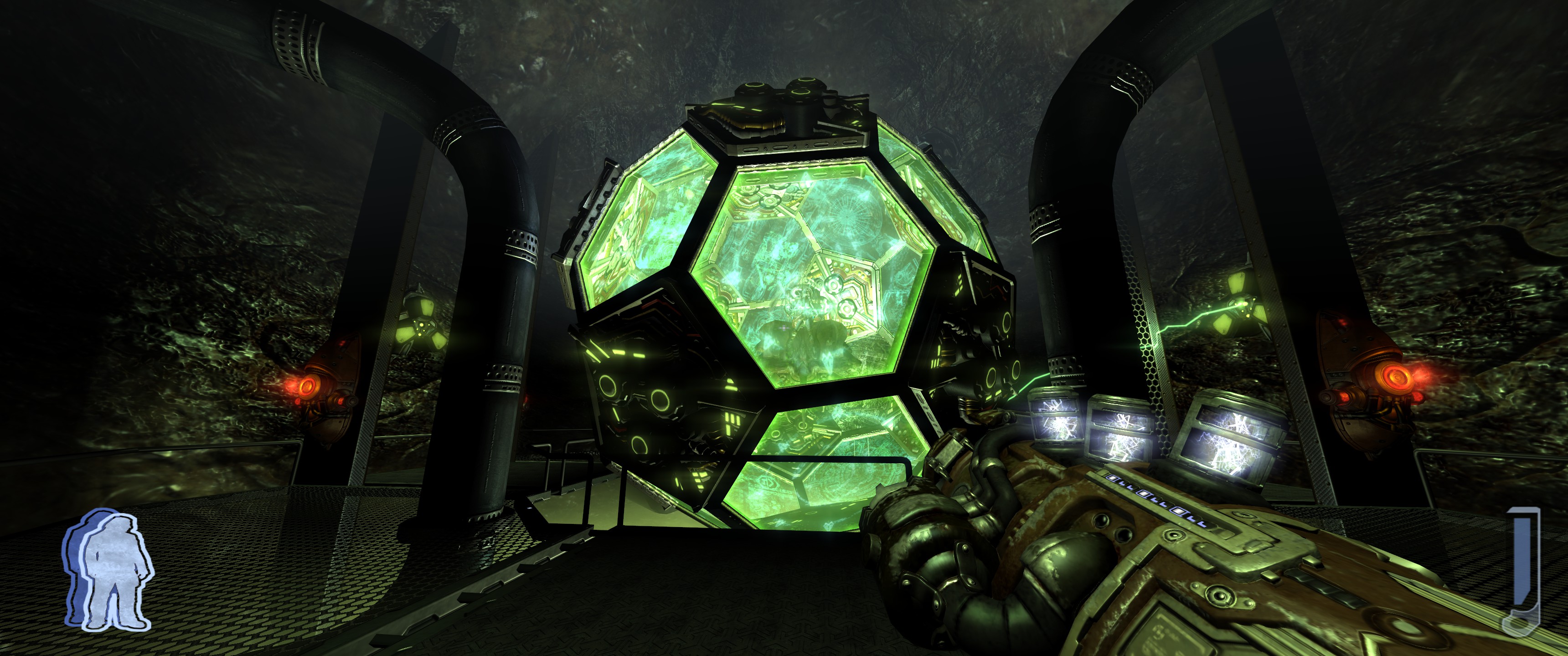
We might never see a game like the original Prey ever again. One of the most alien sci-fi games ever made, you will interact with truly bizarre alien technology for which it is not clear at first glance what they do, and this tech often shifts the level design in unique ways. You and enemies will walk on walls and ceilings and engage in confusing yet adrenaline filled shootouts, you will navigate through weird portals and spatial anomalies, and this is all enabled by the level design.
There are still single player action games with intelligent level design, like the Dishonored series and Arkane’s Prey, but they are now just very few and very far between, much more so than in the mid to late 1990s and 2000s. We really need more games to try again, this issue is so widespread.
Even games I love could have achieved so much more if their level design was far greater than they currently are, games like S.T.A.L.K.E.R. and even many classic RPGs like the Neverwinter Nights and KOTOR games.
Multiplayer Shooters
We return to multiplayer shooters once again, a genre that we like to remind you is one of the most damaged and regressed in modern gaming. These days you’re either going to see a multiplayer shooter release with just one large open world map and usually just a Battle Royale game mode to go along with it (or at least all the emphasis is on this). There is a place for such games of course, but there is obviously too much copycat behavior going on in this regard.
Or you can find multiplayer shooters that stick to the more traditional multiple level, multiple game mode design, except they are lacking in original or creative game modes and the level design is extremely shallow, simplistic, and poorly designed resulting in poor balance and poor tactical or strategic gameplay.
The best example of this is any recent DICE game, such as their Star Wars: Battlefront games (especially the first one) and Battlefield games. Let’s start with the bigger one, Battlefield. The level design has regressed in Battlefield overall, since DICE believes size compensates for quality. Battlefield 4 placed way too much emphasis on skyscrapers resulting in various maps ending up being battles for which team holds skyscrapers and players end up just camping on them with everyone using a sniper rifle loadout. Only the games are technically objective based so you have a majority of players ignoring objectives and just focusing on stupid skyscrapers.
Battlefield level design peaked with Battlefield 2142 in 2006. Its best level design was tied to its Titan game mode. Granted, more complex level design is just an inherent feature of this game mode, which is a trend you will continue to see below. Titan actually requires some serious thinking and planning unlike Rush and Conquest. Without going into too much detail about the game mode, each team has a base of operations which is a large ship that could amount to its own CQB map in a different game. Titan levels have this added complexity, more vertical gameplay, and much more strategic objective based gameplay.
This wouldn’t work well in the simpler modern day Battlefield maps since Titan is all about the objectives. Of course, it’s also worth mentioning that the classic PC exclusive Battlefield games came with more maps out of the box and added more for free, relying much less on paid DLC to have a sizable amount of content, and they were highly moddable, so they were superior not just in level design but everywhere that counts.
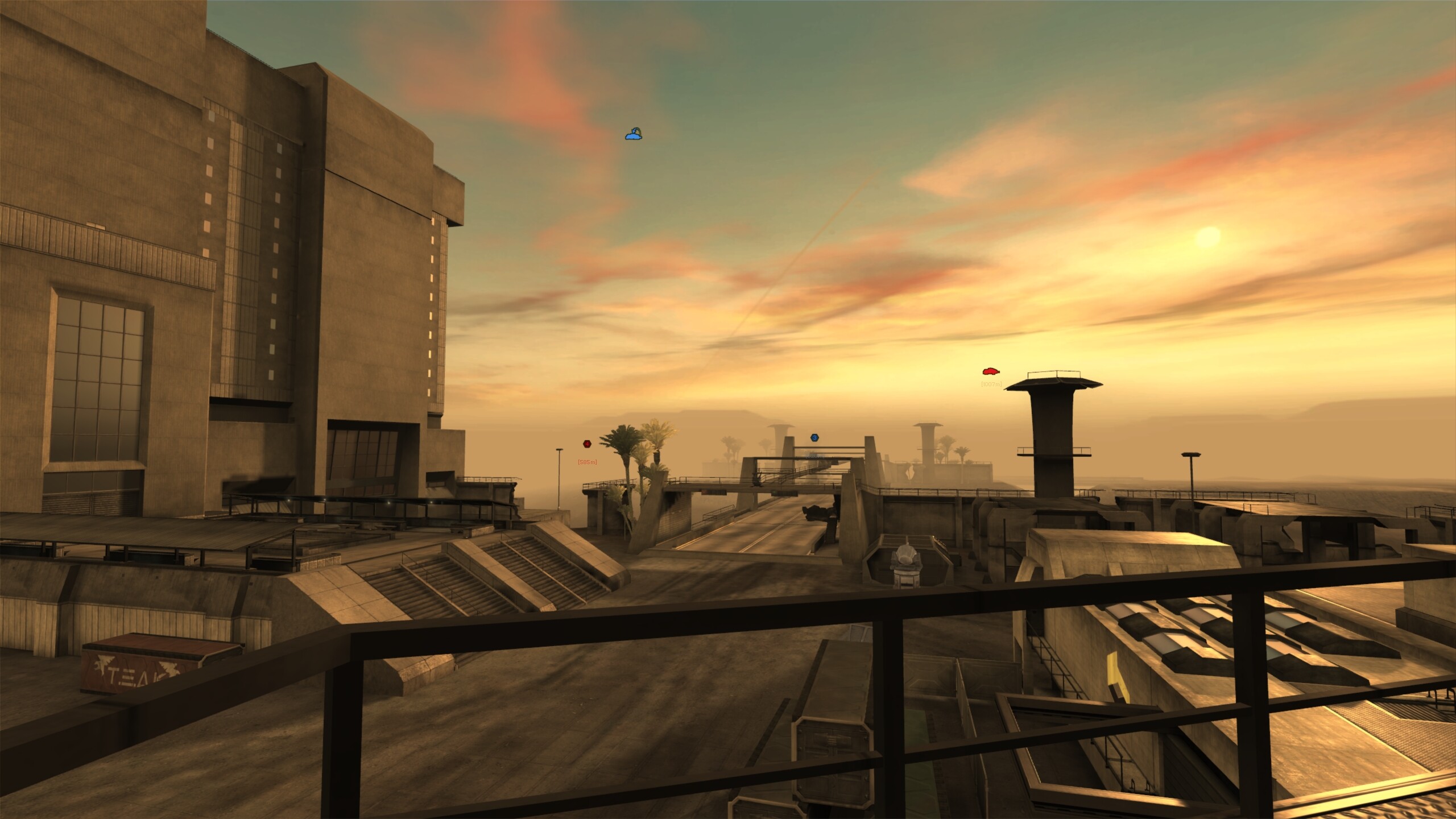
DICE’s first Star Wars: Battlefront game in 2015 really has some of the most pathetic level design I’ve ever seen. The game had such a small amount of them at launch, and just about all of them could’ve been thrown together by one developer in under a day. Tiny, invisible walls everywhere, no detail, poor design for any sort of tactical gameplay. A far cry from the original Battlefront games. DICE’s second game improves things, but not nearly enough to compete with the original games from Pandemic Studios, which still had far more levels and content.
Nothing is worse than modern Call of Duty level design though, beginning with Modern Warfare 3 in 2011 and extending into the latest Modern Warfare game too. So cramped, so gamey for the type of “realistic” warfare games they try to be, these days they try to put doorways everywhere to cut down on camping since camping in the likes of Modern Warfare 3 was hilarious, but their latest game still has such hardly structured oversimplified levels with very little thought put into them, dumbing down their gameplay further.
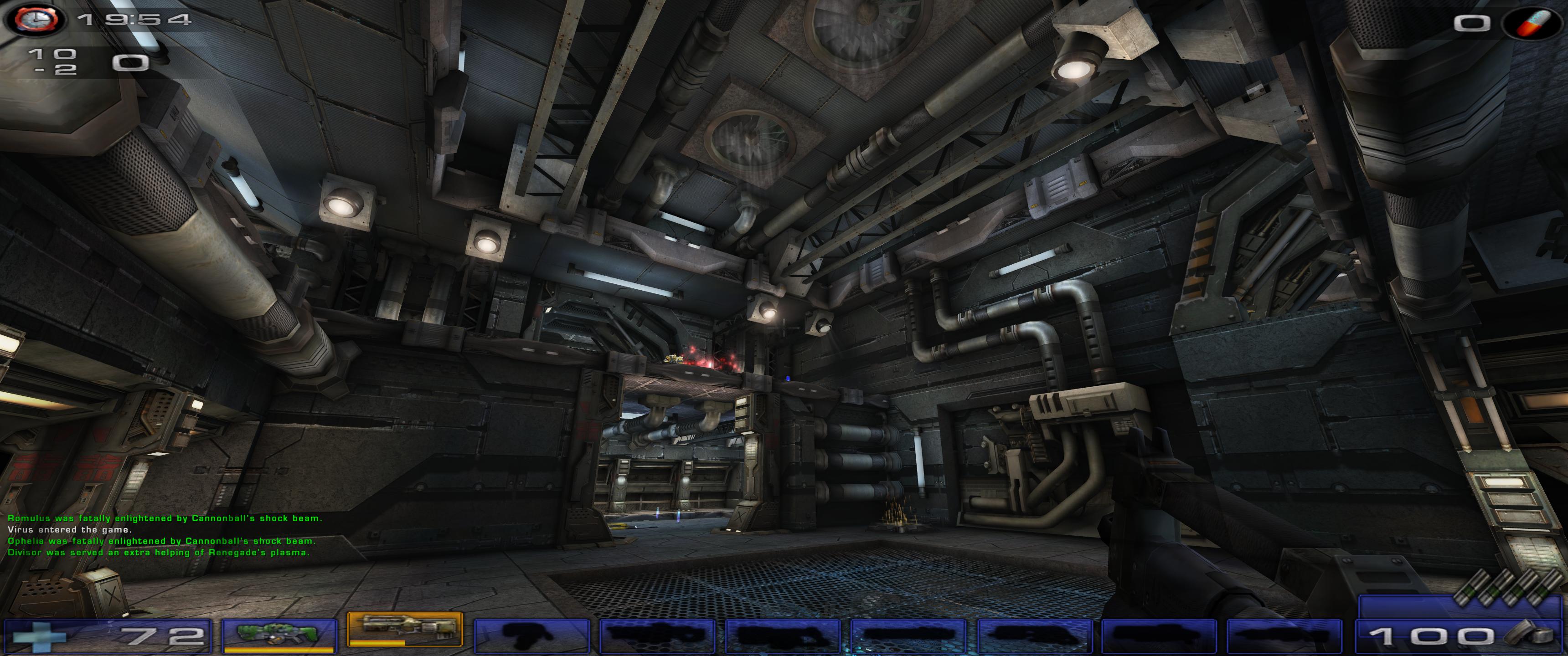
Unreal Tournament 2004 came with 79 completely unique maps out of the box, and around 120 when you count all variations of maps for different game modes. The fundamental level design of Unreal Tournament maps depends on the game mode: Onslaught gets huge open level design comparable to Battlefield Conquest maps. Deathmatch, Team Deathmatch, CTF, Double Domination, and Bombing Run share mostly the same map pool with some differences for some of the game modes, and these maps are much smaller than those of Onslaught, and more like complex arenas which perfectly complements the gameplay, since during these time game studios did care about level design complementing the gameplay. And these arenas were not oversimplified like in a lot of other games.
Then you have the Assault game mode, where each map is a large but linearly progressed series of unique objectives with excellent vantage points for the defenders and interesting offensive paths for the attackers. Every Assault map is a unique story as they are (fictional of course) historical reenactments, so they are all totally unique. The attention to detail and tactical design of these maps far surpasses just about anything today.
Another stand out is Natural Selection 2 which is actually from 2012. Level design is absolutely crucial to the game’s design. This FPS/RTS hybrid, in which one team plays as aliens that can evolve between 5 different forms (yes, Evolve borrows from this) and the other team plays as Marines that can upgrade their equipment to include jetpacks and exoskeletons, is probably the most strategic PvP FPS ever made, but this was only possible with the level design being the way it is.
All fourteen official levels are very large complexes of sorts, with many pathways to get around most of the map, but with important choke points as well. They all have ventilation ducts that only two alien lifeforms can fit through as well. The extreme complexity results in players, even expert ones, constantly using the map since the map also highlights what’s going on and also highlights things that the team commander can point out.
Ultimately, it is just another game that is only possible with the level design being as detailed as it is, opposed to the modern trend of level design hardly making a difference at all. Crysis and Crysis Wars are two other games with incredibly detailed multiplayer game design, both for their Deathmatch/Team Deathmatch modes (Instant Action and Team Instant Action respectively), but most of all for Power Struggle, which is the second most strategic PvP FPS I’ve ever come across. And out of the box, Crysis Wars comes with over 20 maps, and they are all outstanding.
Level design is hugely important in other classics as well, from Quake to Wolfenstein: Enemy Territory to Counter-Strike. Those games simply would not work if they had the oversimplified low-effort level design of modern Call of Duty games in which players often end up resembling chickens running around with no heads.
Role-Playing Games
Dumbed down level design has taken over the RPG genre too. Look no further than Pillars of Eternity (2015) and the second half of Wasteland 2 (2014) which have so much unnecessary, unused space that’s there just to artificially make the games bigger. Although no game better showcases this mindless flaw than The Outer Worlds last year. These games are also extremely static compared to many of the classic RPGs.
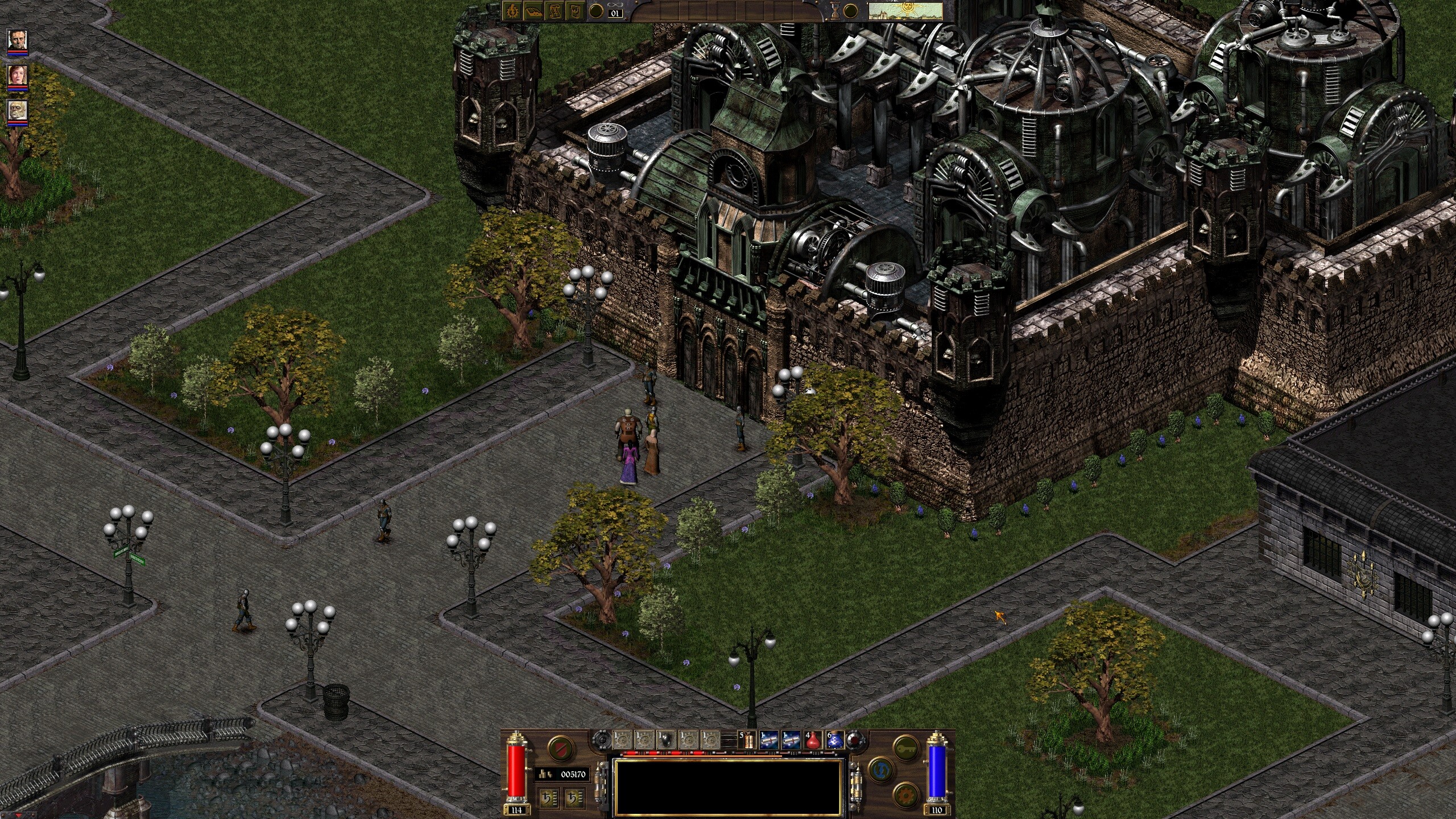
Some of the best RPG level design belongs to Fallout (1997), Fallout 2 (1998), Planescape: Torment (1999), and Arcanum: Of Steamworks and Magick Obscura (2001). Those not only excel artistically unlike Pillars of Eternity, Tyranny, and so many other low-effort modern RPGs, but one of the areas where their level design is most distinct is in interactivity.
Whether it’s the Fallout games letting you use dynamite to blow open even the most important doors in the game, resulting in attentive players having a meaningful advantage opposed to having the games artificially limit you, to Arcanum where you can, for example, find an important ring that has a manufacturer’s name on it so you can track down the manufacturer to the city of Tarant, navigate the sprawling city using street signs (hardly any games have this detail), and find their building because their address label has the company name on it.
Then there’s Planescape: Torment living up to its reputation and having very bizarre yet thoughtfully incorporated object and character interactions and hidden portals (don’t even get me started on Torment: Tides of Numenera). You can just interact with those games’ worlds on so many more levels than today’s static tech demos or low-effort nostalgic money grabs that are passed off as games, not unlike with single player shooters as discussed above.
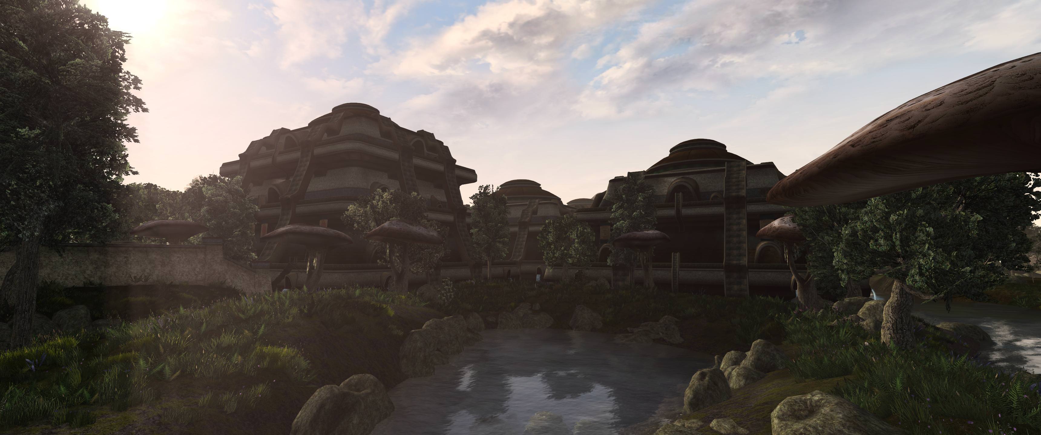
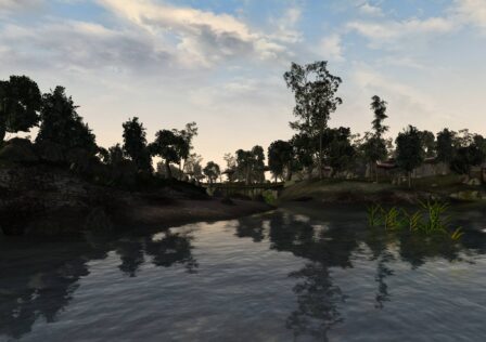
How about The Elder Scrolls? Skyrim from 2011 heavily influenced the gaming industry to move to larger, less linear levels, except most games are even worse at this design, often having so much wasted empty space. But when you compare Skyrim and Morrowind, Skyrim is so much weaker artistically compared to the otherworldly richness of Morrowind. Skyrim’s cities are the size of small villages in Morrowind, which has much more believable cities.
Skyrim is so artificially squished together; it is not very seamless when you go from the hot springs regions to frozen regions, clearly the result of console limitations and no mods can fix this, but Morrowind suffers no such flaws. When you play Morrowind, especially with mods so it looks like the above screenshot, you feel much more like you’re stepping into another reality, while in Skyrim, even if modded to the point where it can break at any second, you still feel like you’re just loading up a PS3/XBOX 360 era game.
Strategy Games
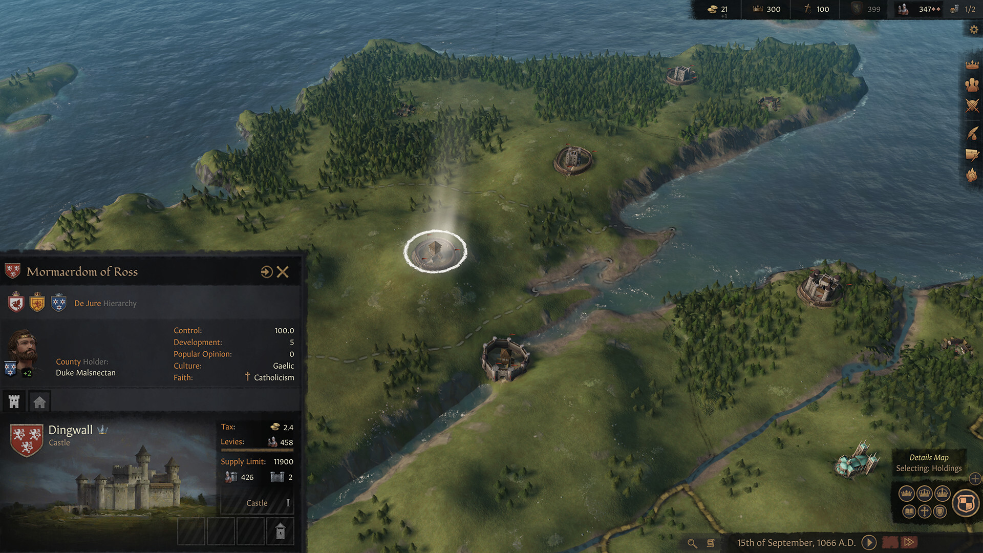
There are some interesting things happening today with level design in strategy games. One regression we’re seeing is games with continental map views tend to be pursuing a more cartoony and/or far less detailed look, which is 100% regression. Take a look at this example below.
This trend is also evident in the Total War series when you compare the cartoonier, less detailed campaign map of Total War: Three Kingdoms (2019) to that of Total War: ATTILA (2015).
Speaking of Total War, newer Total War games not having Attila’s inner city battle maps is another level design regression, but we also want to discuss something that’s not a regression but is instead stagnation. Total War’s battle map design is rather outdated by now, not by strategy game standards (they’re still more detailed and intuitive than that of most RTS/RTT games) but by the standards modders have set. The two videos below summarize it: the top one is an official map, the bottom is made by modders. No official Total War map is as good as that modded one.
Both of those are city siege maps, but by the time the siege and battle are finished in the official map, things are just starting to heat up in the modded map. There are many other types of modded maps, e.g. maps with really deep and brutal trench lines, that only exist in mods. It is time for CA to step up their game and match what modders are doing. Take note form Valve Corporation who, back in the day, when they saw modders doing awesome things with their engine they would hire the modders.
Reduced effort in level design is a trend in so many other genres as well, not just these. You can see it if you compare Silent Hill: Homecoming to any of the four first games, or if you compare Tony Hawk’s Pro Skater 5 or even the fourth game to the second and third games. In both of these examples and so many more, the level design shines so much more in the classics.
In conclusion, we’re seeing level design in modern gaming more consistently become an afterthought, when in the past, genius level design was often one of many noteworthy characteristics about a game. I suppose this makes intelligent level design like so many other important aspects to a game such as writing, good technology and using this to enhance gameplay, effective AI, and moddability; mostly a thing of the past.






In the horror department a good example would be The Evil Within, and you can see the decline happen during the game. The village in the beginning is rather open-ended; it has places to explore, there are patrolling enemies, hiding places, traps you have to look out for, there’s little ammunition to find et cetera. It encouraged stealth and exploration. Things change quite quickly, however, and then it feels as if you are playing a different game entirely. The levels are smaller and more linear, there is next to no exploration, ammo can be found all over the place, enemies… Read more »
That’s right, I forgot that game existed. It always seemed inspired by Resident Evil 4 but with much more identity crisis.
To nobody’s surprise, you present the claim of 2142 having the best map design in the series despite it being the worst. This passage in particular is a strong demonstration of how much crap you manage to fit in just one paragraph of these awful low IQ articles: “Battlefield level design peaked with Battlefield 2142 in 2006. Its best level design was tied to its Titan game mode. Granted, more complex level design is just an inherent feature of this game mode, which is a trend you will continue to see below. Titan actually requires some serious thinking and planning… Read more »
Conquest isn’t much more than TDM, it’s just a matter of holding down more points but it doesn’t matter which, or killing opponents like TDM. Whereas Titan is much more objective based and everything has to be done correctly. More teamwork is required in Titan since objectives have to be prioritized and done in order and because you can’t just win by killing the other team.
You talk a lot about low IQ since you’re clearly an expert in the subject.